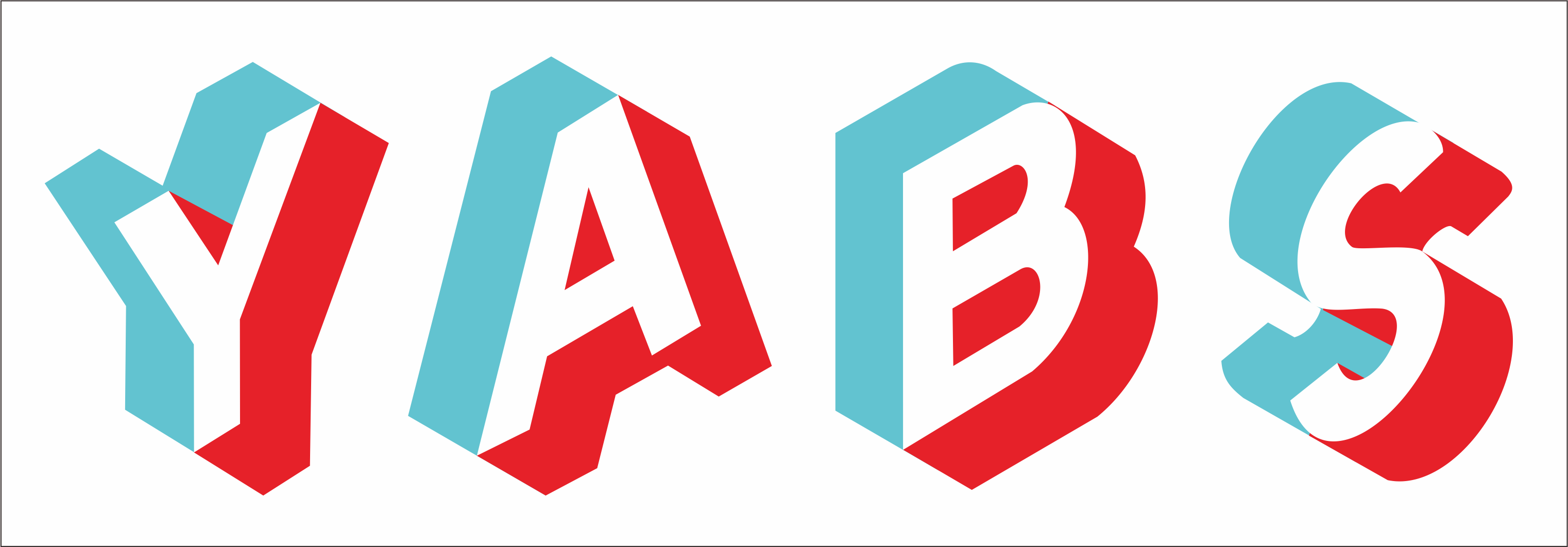
YABS Banner/Logo Competition -- Calling All Graphic Gurus -- Prizes & Street Cred - Submit by 11 Jan

MasonMason OGSenpai
edited December 2020 in General

I'm looking for a new logo/banner design to be face of the Yet Another Bench Script (YABS) project. I would like to swap out the xkcd comic currently on the repo page and instead replace it with a design created by someone in the community. Because I see YABS as a community-powered project, I'd also like to source the logo design from the community as well instead of heading to Fiverr or some other site.

Friendly Competition Details:

  • Submissions due by 1700 EST (2200 UTC), 11 January 2021
  • LES Poll will determine winner after all submissions gathered (community picks winner, basically)
  • Dimensions don't matter too much, it'll be scaled to not take up an obscene amount of space in the GitHub repo
  • Themes to consider: community-focused, open-source, disk/network/cpu performance, Linux, etc.
  • Multiple submissions are allowed

Prizes To Be Had:

  • Winner will be mailed some stickers that I have from various providers in the community
  • $20 sent to your LES provider of choice as account credit (or donated to charity of your choice)
  • Winner's design added to the YABS repo with attribution/link to personal webpage
  • Mad street cred and bragging rights
  • $50 Nexus Bytes credit courtesy of @seriesn

Post your submissions in this thread in the next 2 weeks (by 11 Jan) to be included in the winner selection poll. Let me know any questions/concerns that you have.

Cheers!,
-Mason

yabs daddy

«134

Comments

  • MasonMason OGSenpai

    Designs Submitted by @AnthonySmith

    yabs daddy

  • MasonMason OGSenpai

    Design Submitted by @Ympker

    yabs daddy

  • MasonMason OGSenpai

    ASCII Art Submitted by @MaxKVM

                       ////:      -////.    .//////      -/////////:.      .:/++++/.                    
                       :yyyy:    /yyyy:    .yyyyyyy.     yyyyyyyyyyyys.  -syyyyyyyyys.                  
                        +yyyy` `oyyyo`    .yyyyyyyy/    -yyyy/---+yyyy+ :yyyy/``.yyyyo                  
                         syyyo.syyy/     .yyyy-oyyyy    +yyyy   `/yyyy- oyyyy+.  .---.                  
                         .yyyyyyys.     -yyyy- :yyyy.   yyyyyyyyyyyy/`  -yyyyyyyso/.                    
                          -yyyyy/      -yyyys++oyyyy+  -yyyyoooosyyyy/    -/osyyyyyy/                   
                          `yyyy/      -yyyyyyyyyyyyyy  +yyyy     syyyy.----   `:yyyyy                   
                          :yyyy.     -yyyy:`````+yyyy-`yyyyo---:+yyyy++yyyy/.``:yyyyo                   
                          oyyys     :yyyy:      -yyyy+-yyyyyyyyyyyyo: `oyyyyyyyyyys/                    
                          ////-    `:///-       `////:-////////::-`     .:/++++/:.`                
    

    yabs daddy

  • MasonMason OGSenpai

    ASCII Art Submitted by @thedp

    8    8 8""""8 8""""8   8""""8 
    8    8 8    8 8    8   8      
    8eeee8 8eeee8 8eeee8ee 8eeeee 
      88   88   8 88     8     88 
      88   88   8 88     8 e   88 
      88   88   8 88eeeee8 8eee88 
    

    yabs daddy

  • MasonMason OGSenpai

    Design Submitted by @Chievo

    yabs daddy

  • Yabs being one of the most used script on our system, here's a Nexus Byte love to support the contest,

    Winning designer will be eligible for $50 Nexus Bytes Service credit :)

  • YmpkerYmpker OGContent WriterSenpai

    @Mason said:
    Design Submitted by @Ympker

    Might submit some more since this is more of a mockup, not a real "logo". Gotta see if I find the time though ;)

  • MasonMason OGSenpai
    edited December 2020

    @seriesn said:
    Yabs being one of the most used script on our system, here's a Nexus Byte love to support the contest,

    Winning designer will be eligible for $50 Nexus Bytes Service credit :)

    You the man! <3

    yabs daddy

  • @Mason said:
    ASCII Art Submitted by @MaxKVM

                       ////:      -////.    .//////      -/////////:.      .:/++++/.                    
                       :yyyy:    /yyyy:    .yyyyyyy.     yyyyyyyyyyyys.  -syyyyyyyyys.                  
                        +yyyy` `oyyyo`    .yyyyyyyy/    -yyyy/---+yyyy+ :yyyy/``.yyyyo                  
                         syyyo.syyy/     .yyyy-oyyyy    +yyyy   `/yyyy- oyyyy+.  .---.                  
                         .yyyyyyys.     -yyyy- :yyyy.   yyyyyyyyyyyy/`  -yyyyyyyso/.                    
                          -yyyyy/      -yyyys++oyyyy+  -yyyyoooosyyyy/    -/osyyyyyy/                   
                          `yyyy/      -yyyyyyyyyyyyyy  +yyyy     syyyy.----   `:yyyyy                   
                          :yyyy.     -yyyy:`````+yyyy-`yyyyo---:+yyyy++yyyy/.``:yyyyo                   
                          oyyys     :yyyy:      -yyyy+-yyyyyyyyyyyyo: `oyyyyyyyyyys/                    
                          ////-    `:///-       `////:-////////::-`     .:/++++/:.`                
    

    I like this one, would fit in the script header too.

    https://inceptionhosting.com
    Please do not use the PM system here for Inception Hosting support issues.

  • _MS__MS_ OGSenpai

    Have you tried turning it off and on again?

  • TheDPTheDP OGSenpai

    Sorry, I embrace simplicity :joy:

  • Not_OlesNot_Oles Hosting ProviderContent Writer

    @Mason said:
    Designs Submitted by @AnthonySmith

    We are not going to beat the alliterative awesomeness of "Because dee dee ha didts day."

    Of course, no matter how poetic, a phrase still might not be a logo. "A phrase does not a logo make."

    Moreover, it's probably an issue that a few | some | many people might not know about dd.

    Here's a terrible visual logo idea: a gorgeous, potted Yabsemum blooming next to the tombstone of dd.

    Well, maybe a Yabs logo somehow could be based on a Yabsemum?

    I want to see what @vyas proposes!

  • Source attached (distributed under WTFPL ;)

  • imokimok OG
    edited December 2020

    @thedp said:

    Sorry, I embrace simplicity :joy:

    This one looks good. I think it needs more contrast though.

  • I'm no artist but I looked through the ascii generators and thought these looked the best.

    I prefer the lowercase but it takes a few extra lines which might be too much.

  • Hi,

    This is YABS logo I designed:

    For ASCII you could use this:

                      ___                         ___     
                     /\  \         _____         /\__\    
          ___       /::\  \       /::\  \       /:/ _/_   
         /|  |     /:/\:\  \     /:/\:\  \     /:/ /\  \  
        |:|  |    /:/ /::\  \   /:/ /::\__\   /:/ /::\  \ 
        |:|  |   /:/_/:/\:\__\ /:/_/:/\:|__| /:/_/:/\:\__\
      __|:|__|   \:\/:/  \/__/ \:\/:/ /:/  / \:\/:/ /:/  /
     /::::\  \    \::/__/       \::/_/:/  /   \::/ /:/  / 
     ~~~~\:\  \    \:\  \        \:\/:/  /     \/_/:/  /  
          \:\__\    \:\__\        \::/  /        /:/  /   
           \/__/     \/__/         \/__/         \/__/    
    

    Or this:

                      ___                         ___     
          ___        /  /\         _____         /  /\    
         /__/|      /  /::\       /  /::\       /  /:/_   
        |  |:|     /  /:/\:\     /  /:/\:\     /  /:/ /\  
        |  |:|    /  /:/~/::\   /  /:/~/::\   /  /:/ /::\ 
      __|__|:|   /__/:/ /:/\:\ /__/:/ /:/\:| /__/:/ /:/\:\
     /__/::::\   \  \:\/:/__\/ \  \:\/:/~/:/ \  \:\/:/~/:/
        ~\~~\:\   \  \::/       \  \::/ /:/   \  \::/ /:/ 
          \  \:\   \  \:\        \  \:\/:/     \__\/ /:/  
           \__\/    \  \:\        \  \::/        /__/:/   
                     \__\/         \__\/         \__\/    
    

    A simple uptime dashboard using UptimeRobot API https://upy.duo.ovh
    Currently using VPS from BuyVM, GreenCloudVPS, Gullo's, Hetzner, HostHatch, InceptionHosting, LetBox, MaxKVM, MrVM, VirMach.

  • TheDPTheDP OGSenpai

    @imok said:

    @thedp said:

    Sorry, I embrace simplicity :joy:

    This one looks good. I think it needs more contrast though.


  • @thedp said:

    @imok said:

    @thedp said:

    Sorry, I embrace simplicity :joy:

    This one looks good. I think it needs more contrast though.

    Too much contrast.

  • MasonMason OGSenpai

    Keep in mind y'all, this is for the logo/graphic on the github page, not necessarily for a header in the script output itself :)

    Adding anything to the script output might be worth a separate discussion.

    yabs daddy

  • @Mason said: Keep in mind y'all, this is for the logo/graphic on the github page, not necessarily for a header in the script output itself

  • TheDPTheDP OGSenpai

    Just doing this for fun btw, not after any prizes or glamour ?

  • MasonMason OGSenpai

    @imok said:

    @Mason said: Keep in mind y'all, this is for the logo/graphic on the github page, not necessarily for a header in the script output itself

    We'll see. I'd like to keep the script output pretty streamlined/minimal. Won't be changing the font/color of the text in the output, for instance. But if the ascii is small enough (not an obscene number of lines) then I may consider it

    yabs daddy

  • Ok, I'm out.

  • MasonMason OGSenpai

    @ben47955 said: Ok, I'm out.

    I think we have a winner

    yabs daddy

  • @ben47955 said:

    Ok, I'm out.

    Simplicity is beautiful. :smiley:

  • YmpkerYmpker OGContent WriterSenpai

    Quite some nice ideas here :) This community surprises me every day :)

  • @Mason said: Keep in mind y'all, this is for the logo/graphic on the github page

    nah, instead you should already think about merchandise...

This discussion has been closed.